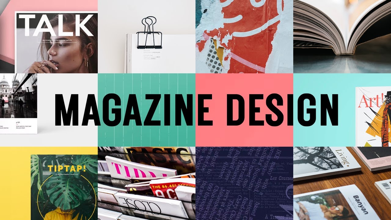
Whether you are creating an internal company publication, a lifestyle blog turned print magazine, or a nonprofit annual report, the quality of your visual data can make or break your reader’s experience. Most people assume that designing a polished magazine is only possible with expensive software or a dedicated design team. The reality has changed dramatically. Today’s online magazine design tools offer far more than layout templates and font pickers. The best ones let you integrate charts, graphs, and full infographic elements directly into your spreads, giving your data a visual voice that words alone cannot match. This article breaks down what to look for in a magazine design tool, how to use data visualization features effectively, and which workflows actually produce professional results.
Why Charts and Graphs Matter in Magazine Design
It is easy to underestimate how much a well-placed chart or graph improves reader comprehension and engagement. Studies in visual communication consistently show that readers process visual data faster than body text and are more likely to remember information when it is paired with a relevant graphic. For magazine creators, this means that data-heavy stories, trend reports, or how-to guides become more compelling and readable when supported by visuals.
The challenge has always been integration. In the past, you might design a magazine layout in one tool and pull in a chart built in a separate spreadsheet application, only to end up with a file management headache and inconsistent visual styling. Modern all-in-one design platforms have largely solved this problem by building data visualization features directly into the same workspace where you design your pages. The result is a faster workflow, a more cohesive aesthetic, and much less frustration.
For content creators, journalists, marketers, and educators, this shift is significant. You no longer need to be a trained graphic designer to produce a magazine that looks like it came from a professional publishing house. You just need the right tool and a clear understanding of how to use it.
What to Look for in a Magazine Design Tool With Data Visualization
Not all design tools are created equal when it comes to charts and infographics. Before committing to a platform, it helps to know exactly which features separate a capable tool from a truly comprehensive one.
Core visualization features to prioritize:
- Editable chart types include bar, line, pie, area, scatter, and donut charts
- The ability to input custom data or import from a spreadsheet
- Color theming that ties charts to your overall magazine palette
- Infographic elements like icons, timelines, and data callout boxes
- Responsive sizing so visuals scale properly across digital and print formats
- The option to layer text over charts or wrap body copy around visualizations
Beyond the technical checklist, look for a tool that keeps your design workflow unified. Switching between multiple applications mid-project introduces inconsistency and slows you down. The ideal platform lets you build your layout, drop in a chart, adjust its colors to match your brand, and move on, all within the same interface.
10 Tips for Creating Magazines With Powerful Charts and Infographic Features
1. Start With a Purpose-Built Magazine Maker
The single best thing you can do before designing a single page is choose a tool built specifically for this type of content. A general-purpose image editor is not the same as a magazine layout platform, and the gap becomes obvious the moment you need to insert a multi-page spread with data visualizations.
Adobe Express is one of the most versatile options available for this kind of work. Its magazine maker gives you access to professionally designed templates alongside a robust toolkit for adding charts, graphics, and branded visuals. Because it sits within the Adobe ecosystem, it brings a level of design credibility and creative flexibility that general consumer tools often cannot match. Whether you are working on a print-ready PDF or a shareable digital magazine, it is a strong starting point.
2. Match Your Chart Type to Your Story
One of the most common mistakes in magazine design is defaulting to a pie chart for every data point. Each chart type communicates something different, and choosing the wrong one can actually obscure your message rather than clarify it.
Use bar charts when comparing discrete categories side by side. Use line charts when showing trends over time. Use scatter plots when exploring relationships between two variables. Use infographic-style icon arrays when illustrating proportions in a more visual, less technical way. The story you are telling should dictate the chart format, not the other way around. When in doubt, ask yourself: what is the single most important takeaway from this data? Then choose the chart that makes that takeaway immediately obvious.
3. Keep Your Color Palette Consistent Across All Visuals
Inconsistent color use is one of the fastest ways to make a professional magazine look amateurish. When your bar chart uses three shades of blue but your infographic sidebar uses orange and green, the overall design feels fragmented, even if each individual element looks fine on its own.
Most quality magazine design tools allow you to save a brand color palette and apply it across all visual elements, including charts. Take the time to do this at the start of your project. Choose two to four primary colors that align with your publication’s identity, then use tints and shades of those same colors for data visualization. A chart does not need to be colorful to be effective. Often, a restrained, on-brand palette communicates more authority than a rainbow of competing hues.
4. Use White Space Intentionally Around Data Visuals
Charts and infographics need room to breathe. When you crowd a visualization against body text or push it flush to a page edge, you reduce its visual impact and make the layout feel cluttered. Professional magazine designers use generous margins and padding around data visuals to signal importance and give the reader’s eye a clear path through the content.
As a rule of thumb, treat any chart or infographic as a visual anchor on the page. Give it at least as much surrounding white space as you would a pull quote or a full-bleed photograph. If a chart feels small or cramped in context, it is usually better to resize it to fill more of the column width than to surround it with competing elements.
5. Write Descriptive Captions That Add Value
A chart caption in a magazine is not just a label. It is an opportunity to provide context, highlight the key finding, or direct the reader’s attention to the most important part of the visual. Many designers write captions like “Figure 2: Revenue by Quarter,” which tells the reader nothing they cannot already see.
Instead, write active captions that interpret the data: “Sales grew 34 percent in Q3, outpacing every previous quarter in company history.” This approach treats the caption as editorial content, not just metadata. It also helps readers who skim, giving them the data insight even if they do not pause to analyze the chart itself.
6. Use Infographic-Style Spreads for Data-Heavy Issues
If you are designing an issue around a research report, an annual review, or any content with significant statistical depth, consider devoting a full spread or a dedicated section to an infographic layout. These pages use a combination of charts, icons, callout statistics, timelines, and short text blocks to present information in a visually rich format that rewards close reading.
Infographic spreads work especially well for year-in-review publications, impact reports, health and wellness magazines, and financial newsletters. They give your readers a sense of scale and significance that a table of numbers in a sidebar simply cannot achieve. Most modern design tools offer infographic-focused templates as a starting point, which you can then populate with your own data and brand elements.
7. Optimize for Both Digital and Print Output
One of the most overlooked aspects of magazine design is the difference between how something looks on a screen and how it renders in print. Colors behave differently between RGB (screen) and CMYK (print) profiles. A thin, elegant chart line that reads clearly on a monitor may nearly disappear when printed at 300 dpi.
Before finalizing any issue, export a proof and review every chart and infographic element at its intended output size. Check that font sizes inside charts are legible at print scale, that color contrasts remain visible, and that any data labels are positioned clearly. If your design tool allows you to toggle between print and digital preview modes, use both before sending anything to a printer or publishing platform.
8. Layer Supporting Stats Into Your Editorial Design
You do not always need a full-page infographic spread to incorporate data visualization. One of the most effective techniques in modern magazine design is integrating data callouts, single-stat highlights, and mini charts directly into editorial layouts alongside photography or illustration.
A single large number in a styled text box, a small inline bar chart within a sidebar, or a progress indicator embedded in a feature article can significantly elevate the perceived quality of your publication. These micro-visualizations add editorial depth without overwhelming the layout. They also give designers and editors a flexible tool for reinforcing the most important data points at exactly the moment the reader needs them.
9. Use Iconography to Humanize Data
Raw numbers are necessary for accuracy, but icons and illustrated elements make data memorable. An infographic showing employee wellness statistics hits differently when it uses silhouette icons of people rather than a standard table. Visual metaphors create emotional resonance, which drives both engagement and recall.
Many magazine design tools include libraries of editable icons that you can resize, recolor, and incorporate into custom infographics. When using iconography alongside data, make sure the icons are thematically consistent with each other and proportionally scaled to reflect the values they represent. An icon that is twice as tall to represent a value twice as large is far more intuitive than two identically sized icons with numbers attached.
10. Test Readability at Multiple Zoom Levels
Digital magazines are read on everything from desktop monitors to tablets to smartphones, often at varying zoom levels. A chart that looks clean and readable at 100 percent on your design canvas may become illegible when scaled down for a mobile reader.
Before publishing, test your issue at 50 percent and 75 percent of its original size. Pay particular attention to axis labels, legend text, and any small annotations within charts. If any element becomes hard to read, either increase the font size within the chart, simplify the visualization, or redesign the element for smaller formats. Accessibility is not just an ethical concern in magazine publishing, it is a practical one. Readers who cannot interpret your visuals will simply skip them.
FAQ
What makes a magazine design tool suitable for adding charts and graphs?
A magazine design tool that genuinely supports charts and graphs needs to go beyond simple image insertion. The best tools include native chart builders where you can input or import your own data, customize colors and labels, and resize the output to fit your layout without losing quality. Equally important is visual coherence, meaning the charts should feel like they belong in the same design system as your typography, photos, and layout templates. Tools that force you to create a chart externally and import it as a flat image are workable but introduce file management friction and make it harder to maintain consistency. Look for platforms that let you edit chart data in place, even after the initial design is complete.
Can I create a magazine-quality infographic without formal design training?
Absolutely. The barrier to entry for infographic design has dropped considerably in recent years. Platforms with template libraries, pre-built infographic layouts, and guided design systems allow non-designers to produce professional-quality results. The key is to start with a well-designed template that already establishes strong visual hierarchy and spacing, then swap in your own data, brand colors, and copy. Where most beginners go wrong is trying to design from a blank canvas without a clear understanding of layout principles. Templates eliminate that problem by giving you a proven structure to work within. Over time, as you develop an eye for what works, you can begin customizing more aggressively or building layouts from scratch.
What chart formats work best for magazine layouts specifically?
For magazine design, simplicity and legibility at varied reading distances are the guiding principles. Horizontal bar charts tend to work better than vertical ones in narrow column layouts because they use horizontal space more efficiently and align naturally with reading flow. Donut charts are visually elegant and work well as callout elements in sidebars or infographic spreads. Line charts are ideal for full-width feature spreads where you have room to show temporal trends in detail. One format that rarely translates well to print or digital magazine layouts is the complex multi-variable scatter plot, which requires close study that most casual magazine readers are not willing to invest. When in doubt, opt for the simplest chart type that accurately communicates your data.
How do I ensure my magazine looks consistent when using multiple types of data visualizations?
Consistency across multiple visualization types comes down to three things: color, typography, and spatial rhythm. Set a single brand palette before you begin and apply it across every chart, icon, callout, and infographic element in the issue. Use the same font family for all chart labels, axis text, and data annotations as you use for your editorial body copy and headlines. Keep margins and padding consistent around all visual elements so the page feels organized rather than scattered. Many design tools offer the ability to save a style guide or theme that automatically applies these settings across new elements. Using that feature consistently is the single most effective shortcut for maintaining a professional, unified look throughout your publication. For journalists and researchers tracking data standards in publishing, resources like the Pew Research Center’s data visualization guidelines offer useful principles that translate directly into magazine design decisions.
Is it possible to produce both a print-ready and digital version of a magazine from the same design file?
Yes, and many modern design platforms are built specifically to support this dual-output workflow. The key considerations are resolution and color profile. Print files typically require a minimum of 300 dpi for all image and chart elements, and colors should ideally be defined in CMYK to ensure accurate ink reproduction. Digital versions are designed for RGB color and can be exported at lower resolutions for faster loading without sacrificing on-screen quality. Some platforms handle this automatically through separate export presets, while others require you to manually adjust settings. If you plan to publish in both formats regularly, it is worth confirming that your chosen tool supports high-resolution PDF export for print alongside web-optimized formats like interactive PDF or HTML-based digital publication. Building both versions from a single source file saves significant time and ensures visual parity between the two.
Conclusion
Designing a magazine that integrates charts, graphs, and infographic elements used to require a team of specialists and high-end desktop software. That is no longer the case. The tools available today give individual creators, small teams, and large organizations alike the ability to produce publication-quality work that communicates data with clarity and visual sophistication.
The most important step is choosing a platform that brings layout design and data visualization into a single, unified workspace. From there, the tips in this article, from matching chart types to your editorial story, to testing readability across devices, to building a consistent color system, give you a practical roadmap for elevating every issue you create. Whether you are launching a new publication or leveling up an existing one, the combination of the right tool and a thoughtful design approach will set your work apart.